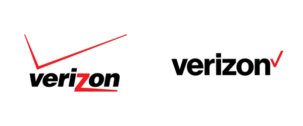
 Last week there were some big changes for two huge, global brands. Both Google and Verizon unveiled new logos to the public, and both have been received with mixed reviews.
Here's a before and after look at the marks:
Last week there were some big changes for two huge, global brands. Both Google and Verizon unveiled new logos to the public, and both have been received with mixed reviews.
Here's a before and after look at the marks:
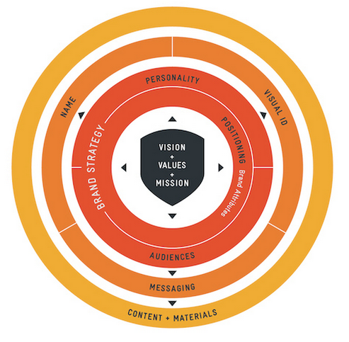
The concept of "branding" is one most folks are familiar with, but it can prove to be a nebulous beast that is tricky to fully characterize. It's simple enough to come up with definitions for things like a logo, color palette, typographical hierarchy, iconography, and so forth. And it's true--these things are all components of a brand. But a brand is more than just what a company looks like. "Brands are intangible assets, created by the emotions that people feel when they experience, purchase, or use your products (or services)," to quote John Friedman from the Huffington Post. This means that your brand is not only who you think you are, but who your consumers think you are based on the combination of your company's visual aesthetics, tone in messaging, choice of actions, and much more. The development of your brand might look a little something like this:
 Last week there were some big changes for two huge, global brands. Both Google and Verizon unveiled new logos to the public, and both have been received with mixed reviews.
Here's a before and after look at the marks:
Last week there were some big changes for two huge, global brands. Both Google and Verizon unveiled new logos to the public, and both have been received with mixed reviews.
Here's a before and after look at the marks:
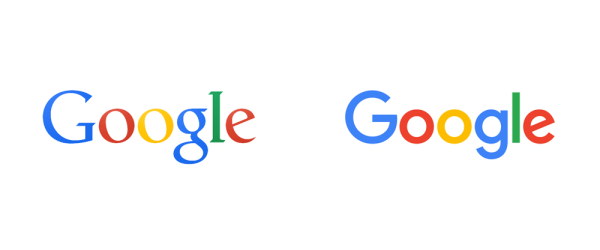
 Google's new look was preceded by the announcement of an equally new parent organization, Alphabet, that will "house" the team's various products. Check out Larry's letter specifying the details here. Long story short, ventures that are not directly related to Google can now comfortably live under the Alphabet domain. This allows Google to be its own, official entity.
Interestingly, only several days after revealing this powerhouse umbrella company, Google debuted its updated logo. We wonder how much the "Alphabet" concept influenced Google's new aesthetic, which feels much more child-like and seems to plays off of the school block theme portrayed in Larry's letter mentioned above. In Google's blog post, the change is described as one that more accurately portrays "Google working for you" on "even the tiniest of screens." A "seamless" interface that bridges devices, platforms, genres, and media.
However, there are many who are not convinced that this change effectively communicates the trust and history that Google has established with its users over approximately two decades. Sarah Larson's article in The New Yorker is a descriptive explanation of why that may be. To paraphrase, Larson describes the formerly serifed logo to have personality, authority, confidence, maturity -- things she feels the new logo lacks.
And arguably, she does have a point. When we look at the Google logo side-by-side with Verizon's new digs, we can't help but notice some commonalities. For instance, both exude the definition of "modern," sporting clean lines and sans-serif, Swiss-inspired typefaces. Is the desire to be simple, versatile, and adjustable also causing the logos of many brands to become somewhat generic...?
Google's new look was preceded by the announcement of an equally new parent organization, Alphabet, that will "house" the team's various products. Check out Larry's letter specifying the details here. Long story short, ventures that are not directly related to Google can now comfortably live under the Alphabet domain. This allows Google to be its own, official entity.
Interestingly, only several days after revealing this powerhouse umbrella company, Google debuted its updated logo. We wonder how much the "Alphabet" concept influenced Google's new aesthetic, which feels much more child-like and seems to plays off of the school block theme portrayed in Larry's letter mentioned above. In Google's blog post, the change is described as one that more accurately portrays "Google working for you" on "even the tiniest of screens." A "seamless" interface that bridges devices, platforms, genres, and media.
However, there are many who are not convinced that this change effectively communicates the trust and history that Google has established with its users over approximately two decades. Sarah Larson's article in The New Yorker is a descriptive explanation of why that may be. To paraphrase, Larson describes the formerly serifed logo to have personality, authority, confidence, maturity -- things she feels the new logo lacks.
And arguably, she does have a point. When we look at the Google logo side-by-side with Verizon's new digs, we can't help but notice some commonalities. For instance, both exude the definition of "modern," sporting clean lines and sans-serif, Swiss-inspired typefaces. Is the desire to be simple, versatile, and adjustable also causing the logos of many brands to become somewhat generic...?
 Ahem. We'll just leave those there as food for thought.
However, it's important to consider the depth of research and consideration that led to the changes Google made. Though it may now have more similarities to the examples above, it's likely for good reason. In fact, it's eye-opening to read their design blog to see how thoughtful and inclusive their process truly was. And going back to our discussion regarding the definition of a "brand," you can see that Google was keen on developing their logo with a user's experience in mind. They understood the importance of the interactivity consumers have with their products, and refrained from making choices based solely on aesthetics.
Now, as for Verizon, their update was less of a departure from their old look than Google's. The font is essentially the same (though no longer italicized), they've done away with their expansive, gradient "z," and they've repurposed their checkmark. But the question remains: what does this logo say about the Verizon brand? Does this change accurately give customers new information as to who Verizon is, what they stand for, and where their company is going? Verizon's Chief Marketing Officer, Diego Scotti, explains how it does (scroll down to watch his interview video). Ironically, his competitor in some ways agrees with him...
Like Google, Verizon's audience isn't quite sure how to feel about these changes. And it's probably because they are just that--changes. It's like if your best friend decided to suddenly start sporting a mohawk or got new, retro glasses after knowing them for 15 years. It might be somewhat startling. But after the shock had worn off, it might be clear that their new style suits them far better. Their new look might better communicate the key elements that make them a great person to have a relationship with. (Okay, that might be a stretch but you get the idea!)
Ultimately, this delineation is what VDW feels is the most important piece to developing your brand. Your logo is a strong, foundational snapshot of your company's core beliefs and differentiators. What elements can your audience see in your mark that they identify with? That make them trust and want to do business with you? These are the questions we hope we can help you answer when developing your identity, print design, or website. As for the examples above, we'll let you be the judge. Tell us your thoughts in the comments below -- do you think they work well or has something been lost in translation?
Ahem. We'll just leave those there as food for thought.
However, it's important to consider the depth of research and consideration that led to the changes Google made. Though it may now have more similarities to the examples above, it's likely for good reason. In fact, it's eye-opening to read their design blog to see how thoughtful and inclusive their process truly was. And going back to our discussion regarding the definition of a "brand," you can see that Google was keen on developing their logo with a user's experience in mind. They understood the importance of the interactivity consumers have with their products, and refrained from making choices based solely on aesthetics.
Now, as for Verizon, their update was less of a departure from their old look than Google's. The font is essentially the same (though no longer italicized), they've done away with their expansive, gradient "z," and they've repurposed their checkmark. But the question remains: what does this logo say about the Verizon brand? Does this change accurately give customers new information as to who Verizon is, what they stand for, and where their company is going? Verizon's Chief Marketing Officer, Diego Scotti, explains how it does (scroll down to watch his interview video). Ironically, his competitor in some ways agrees with him...
Like Google, Verizon's audience isn't quite sure how to feel about these changes. And it's probably because they are just that--changes. It's like if your best friend decided to suddenly start sporting a mohawk or got new, retro glasses after knowing them for 15 years. It might be somewhat startling. But after the shock had worn off, it might be clear that their new style suits them far better. Their new look might better communicate the key elements that make them a great person to have a relationship with. (Okay, that might be a stretch but you get the idea!)
Ultimately, this delineation is what VDW feels is the most important piece to developing your brand. Your logo is a strong, foundational snapshot of your company's core beliefs and differentiators. What elements can your audience see in your mark that they identify with? That make them trust and want to do business with you? These are the questions we hope we can help you answer when developing your identity, print design, or website. As for the examples above, we'll let you be the judge. Tell us your thoughts in the comments below -- do you think they work well or has something been lost in translation?
Last week there were some big changes for two huge, global brands. Both Google and Verizon unveiled new logos to the public, and both have been received with mixed reviews.
Here's a before and after look at the marks: