Summary: Google has made several recent changes to their search results pages, both in how they look and how they function. I originally set out to write this post primarily about local businesses being added to the "carousel" but quickly went off on several detailed tangents regarding other changes, so I've instead decided to make this is a two part series. I'll cover some more general carousel and search results changes here in "Part I", and then return to the "local carousel" development in Part II later this week.
It's been just over a year since Google announced the release of what is now commonly referred to as the "
Carousel", a companion to the
Knowledge Graph which itself had only launched a few months earlier in 2012. You might recall I gave a more thorough than necessary
tour of the Knowledge Graph Carousel a few weeks after it was released. Well, over the last 11 months there have been a couple of updates/changes so I thought I should write a new post to bring you all up to speed, if you haven't experienced the latest carousel features for yourselves already.
Google Knowledge Graph Carousel Gets a Makeover
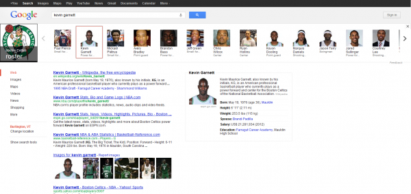
The first change is relatively minor, but no doubt increased interaction with the carousel - the darkening of the background that I think causes it to stand out more. When the carousel first launched the background behind it was white, like the rest of the page. I gave you the example of how it looked at the time, but here it is again as a refresher:

That was after I had searched 'celtics players' and clicked on Kevin Garnett of course, which I can't exactly do today
because he (along with Paul Pierce) have been traded to the Nets. Nevertheless, I did perform the '
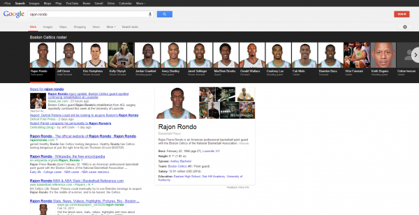
celtics players' Google search and just selected Rajon Rondo this time, so the results are basically the same but you can see how the look of the carousel has changed:

While I wouldn't call the first iteration of the carousel subtle, I think you would agree that the black background draws the eye even more and begs for user engagement, no? Either way, did you notice any
other differences between the two screenshots? Several other items have changed over time that aren't specific to the carousel, but are certainly worth mentioning as part of the overall evolving search results page landscape:
- When you click an individual entity (in this particular example, a person) your search results are still changed to the results for that person's name and the knowledge graph shows that person's photo, name, basic info/bio (usually from Wikipedia) and some other general attributes and information. What's new with the knowledge graph area in general is that you're now also given a handful of clickable sample images of the entity and a "More images" link that takes you to complete Google image search results for the entity.
- When I wrote the original post, Google still had vertical search filters to the left of search results (again, see the first screenshot above), but that has since been replaced with horizontal filters above results (see second screenshot). Interestingly enough I blogged that I was seeing Google testing this new look 2 days after the original carousel post, and they rolled it out fully shortly thereafter.
- Google has painted it's "SIGN IN" button red because they want you signed in as much as possible. The more you're signed in, the more they learn about you as they track your behavior on the web. The more they know about you the better they get at serving you ads that you're more likely to click, which translates into revenue for them.
When I started this post, I did so mainly to talk about another major change to the carousel: the addition of local businesses. But after already going through all of the items above, I've decided that the "local" carousel news deserves its own separate post which I'll publish later this week. As you wait on the edges of your seats for Part II, feel free to let us know what you think about these other changes in our comments below and please tell me if I've missed any others!
 That was after I had searched 'celtics players' and clicked on Kevin Garnett of course, which I can't exactly do today because he (along with Paul Pierce) have been traded to the Nets. Nevertheless, I did perform the 'celtics players' Google search and just selected Rajon Rondo this time, so the results are basically the same but you can see how the look of the carousel has changed:
 While I wouldn't call the first iteration of the carousel subtle, I think you would agree that the black background draws the eye even more and begs for user engagement, no? Either way, did you notice any other differences between the two screenshots? Several other items have changed over time that aren't specific to the carousel, but are certainly worth mentioning as part of the overall evolving search results page landscape:
