It's incredible to see how much the web has changed in just a couple of years. 2013 was coined "the year of responsive web design," as more web developers and users alike recognized the need for websites that supported an amazing user experience regardless of screen size. To get a little bit more of the history and a thorough explanation of what responsive design really is,
check out an article we posted at the dawning of this era.
Now, in 2015, responsive web design is not just something to consider and discuss. It is essential to the web. It's becoming the standard.
Google announced that they will be including mobile-friendliness in their search results algorithms. Virtually all new templates for sites like Wordpress, Weebly, Wix, and Squarespace are responsive. Users have learned to
expect sites to function flawlessly and look stunning, no matter what device they're on.
That's why VDW takes responsive web design seriously, and it has become our absolute design standard. So this fall, VDW launched two revamped, fully responsive websites for a couple of our long-time clients.
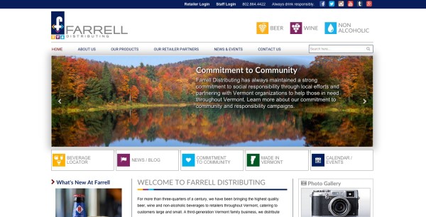
One of whom is
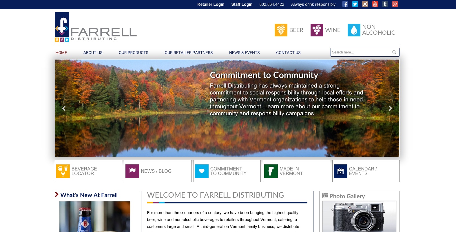
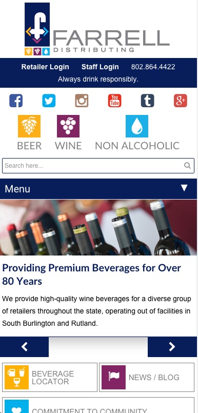
Farrell Distributing. Farrell "provides high-quality beer, wine and non-alcoholic beverages for a diverse group of retailers throughout the state [of Vermont], operating out of facilities in South Burlington and Rutland." VDW's
first launch of Farrell's site featured modern web design, intuitive UI, and great imagery. All of these things hold true in the newest iteration, however this time the site functions seamlessly on devices of all sizes -- including smartphones. This allows Farrell's visitors to get the information they need more efficiently and effortlessly.

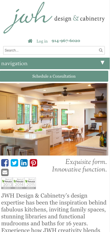
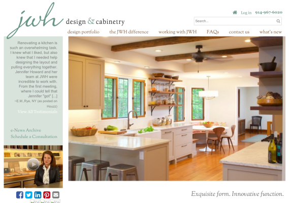
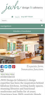
We've also updated the
JWH Design & Cabinetry site. Test it yourself! If you drag the corner of your browser to change its size, you'll see the content adjust so that it still fits perfectly.
The JWH site is very interactive, as its main goal is to provide homeowners with a space to share ideas with designers online. For instance, there is a special tool called the "Worktable" which allows clients to add and store images in personal collections. Now, clients can access their Worktables on any of their devices, and all of the content appears exactly as they expect, in a manner that is easy to use. Earlier this year, Jennifer Howard (JWH owner and principal designer),
received a Houzz award for customer satisfaction. The responsive quality of her site will only further enhance her users' delight!
 We've also updated the JWH Design & Cabinetry site. Test it yourself! If you drag the corner of your browser to change its size, you'll see the content adjust so that it still fits perfectly. The JWH site is very interactive, as its main goal is to provide homeowners with a space to share ideas with designers online. For instance, there is a special tool called the "Worktable" which allows clients to add and store images in personal collections. Now, clients can access their Worktables on any of their devices, and all of the content appears exactly as they expect, in a manner that is easy to use. Earlier this year, Jennifer Howard (JWH owner and principal designer), received a Houzz award for customer satisfaction. The responsive quality of her site will only further enhance her users' delight!