***UPDATE 2-20-14*** - It appears that Google has now rolled out the change to everyone.
If it seems like it's only been a year since I blogged about changes to the Google Analytics interface, it's because it has.
Last January I mentioned some tweaks made to the general layout of GA, which came on the heels of a complete overhaul and eventual removal of the familiar
"old version" many had continued to rely on via a
hidden footer link as Google phased in forced adoption of the new version.
Now here we are in early 2014 and we're all about to see another significant
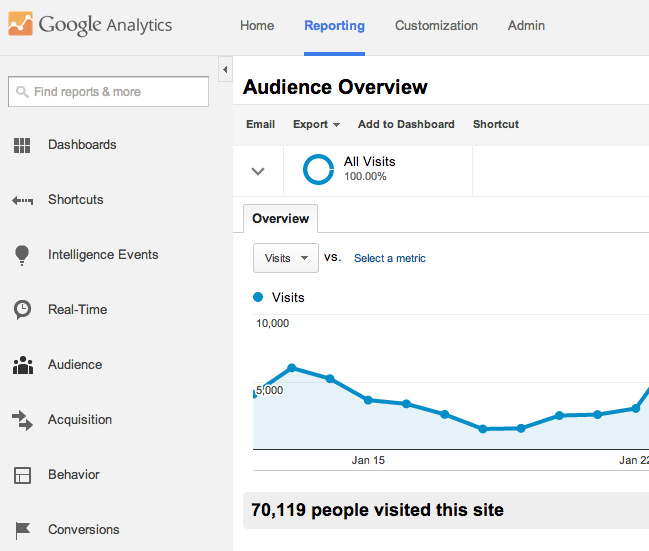
Google Analytics design update. Google+ provided the screenshot below to give you an idea what to expect (
h/t Barry Schwartz):

Some of you may have noticed a shiny new nav and sidebar inside of Analytics. If you're not seeing it yet, you will over the next few weeks. We think this is a simpler and more beautiful way to present your reports, dashboards and will make your analysis easier and faster. See a quick preview below.
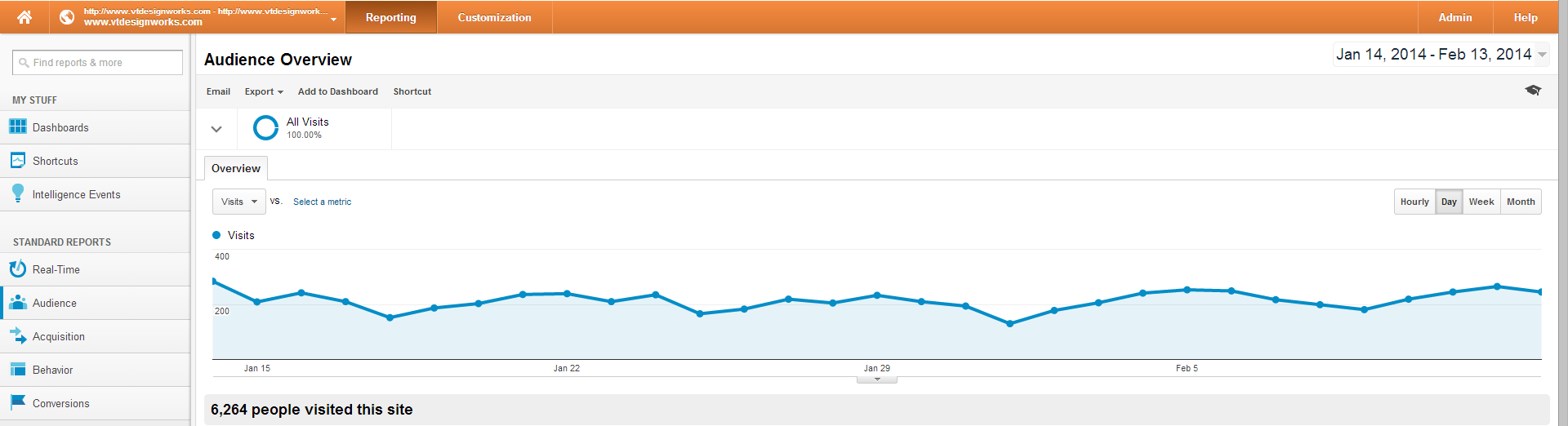
For comparison, here's how the top and side navigation currently looks (click to enlarge):

I've provided a wider screenshot because the "Admin" link currently lives to the far right.
Like the last round of changes, these affect the design more than any function of how Google Analytics works. Perhaps it's the rate at which things change on the web, but despite thinking the current design was quite modern when it was first released, I have to say that the 2014 update seems even more suited for today and it seems to fit the "new Google look" we'll likely see across all products before too long. A similar design change was
recently rolled out in Google Adwords as well:
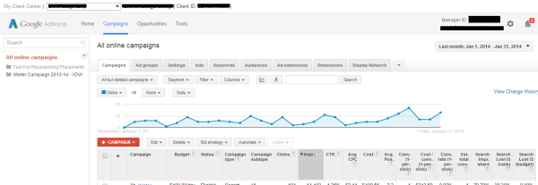
If you were familiar with the old Adwords interface, you probably remember that the main navigation was green and "Billing" and "My Account" were among the items listed. They've been moved to live under the little "gear" drop-down on the right and the sleek new gray look you saw in the Analytics screenshot has replaced the green. Google also appears to be using a new Adwords logo (the green and blue "A").
Again, the goal seems to clearly be a uniform look across all Google products and services.
Getting back to Analytics, the upcoming design update isn't the only change that's taken place in the last year, but I'll save the
reorganization of the the admin area for another day. It happened in the middle of last year and was significant enough that I think it deserves its own post, so keep an eye out.
After reading this, please come back and let us know in the comments below if your Analytics account reflects the new design. It'll be interesting to see if they just flip a switch or if there is a staggered roll-out, which is often the case.
 I've provided a wider screenshot because the "Admin" link currently lives to the far right.
Like the last round of changes, these affect the design more than any function of how Google Analytics works. Perhaps it's the rate at which things change on the web, but despite thinking the current design was quite modern when it was first released, I have to say that the 2014 update seems even more suited for today and it seems to fit the "new Google look" we'll likely see across all products before too long. A similar design change was recently rolled out in Google Adwords as well:
I've provided a wider screenshot because the "Admin" link currently lives to the far right.
Like the last round of changes, these affect the design more than any function of how Google Analytics works. Perhaps it's the rate at which things change on the web, but despite thinking the current design was quite modern when it was first released, I have to say that the 2014 update seems even more suited for today and it seems to fit the "new Google look" we'll likely see across all products before too long. A similar design change was recently rolled out in Google Adwords as well:
 If you were familiar with the old Adwords interface, you probably remember that the main navigation was green and "Billing" and "My Account" were among the items listed. They've been moved to live under the little "gear" drop-down on the right and the sleek new gray look you saw in the Analytics screenshot has replaced the green. Google also appears to be using a new Adwords logo (the green and blue "A").
Again, the goal seems to clearly be a uniform look across all Google products and services.
Getting back to Analytics, the upcoming design update isn't the only change that's taken place in the last year, but I'll save the reorganization of the the admin area for another day. It happened in the middle of last year and was significant enough that I think it deserves its own post, so keep an eye out.
After reading this, please come back and let us know in the comments below if your Analytics account reflects the new design. It'll be interesting to see if they just flip a switch or if there is a staggered roll-out, which is often the case.
If you were familiar with the old Adwords interface, you probably remember that the main navigation was green and "Billing" and "My Account" were among the items listed. They've been moved to live under the little "gear" drop-down on the right and the sleek new gray look you saw in the Analytics screenshot has replaced the green. Google also appears to be using a new Adwords logo (the green and blue "A").
Again, the goal seems to clearly be a uniform look across all Google products and services.
Getting back to Analytics, the upcoming design update isn't the only change that's taken place in the last year, but I'll save the reorganization of the the admin area for another day. It happened in the middle of last year and was significant enough that I think it deserves its own post, so keep an eye out.
After reading this, please come back and let us know in the comments below if your Analytics account reflects the new design. It'll be interesting to see if they just flip a switch or if there is a staggered roll-out, which is often the case.